
Data Analyses and Data Visualizations of Pokémon Base Stats
What are the strongest Pokémon out there, and how can I know?
Introduction
In my last blog post, I web scraped Pokémon base stats data to a CSV file to be used for data analysis. The purpose of this blog post is to observe the methods I used to find the strongest Pokémon based on their base stats. This post will go over the following:
- how to get quick statistics using the “describe” function.
- how to create a correlation matrix of the base stats.
- how to sort values based on a specific column/base stat of the data frame.
For those who are not familiar with Pokémon, a generation is a set of Pokémon games that have specific Pokémon. For example, generation 5 has Pokémon that are not seen at all in previous generations. While data analysis can be done on all the Pokémon, it may be better to analyze them based on a certain generation. In this blog post, I will be doing exploratory data analysis on generation 5 Pokémon. I also filter out the legendary Pokémon, which tend to have much higher base stats than other Pokémon and are usually not seen until much later in the game. The conditions of getting non-legendary generation 5 Pokémon can be met by filtering the data frame with the code below.
black_and_white_df = pokemon_df.iloc[494:635]
The code used to create all the tables and graphs can be accessed in the following Github repository under “pokemon-eda.ipynb.”
The .describe() Function
The “describe” function in Python gives summary statistics for each numeric column. These summary statistics include the mean, quartiles, count, and standard deviation. The code below implements the “describe” function and the corresponding output:
black_and_white_df.describe()

From the above table, the row that I’m most interested in is the 75% row. This gives the 75th percentile of the base stat. If a Pokémon has a base stat that is higher than the corresponding 75th percentile value, then the Pokémon is stronger/faster/more durable compared to most others.
Correlation Matrix
A correlation matrix takes the numerical variables and finds the correlation between two variables at a time. The code below creates a correlation matrix and the following output:
black_and_white_df.corr()
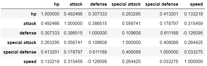
The matrix above shows that the correlation coefficient is high for defense vs. special defense, meaning that a Pokémon with high defense may have high special defense too. Another interesting observation is that defense vs. speed has a weak but negative correlation. For those who are familiar with Pokémon, it would make sense that Pokémon with high defense typically have low speed and vice versa.
Sorting Base Stat Values
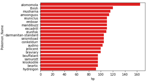
The code used to retrieve those with the highest base stats is pretty simple once the code is figured out for one base stat. The example code below shows code that will sort the values based on the hp column in descending order and then show the top 20 rows:
hp_df = black_and_white_df.sort_values(by='hp', ascending=False).head(20)
I can then use Seaborn to create a horizontal bar plot with the Pokémon name on the y-axis and the base stat value on the x-axis with the following code and output:
sns.barplot(y='Pokemon_Name', x='hp', data=hp_df, color='red')
To see these Pokémon’s other base stats, the data frame can be printed out with the following result:
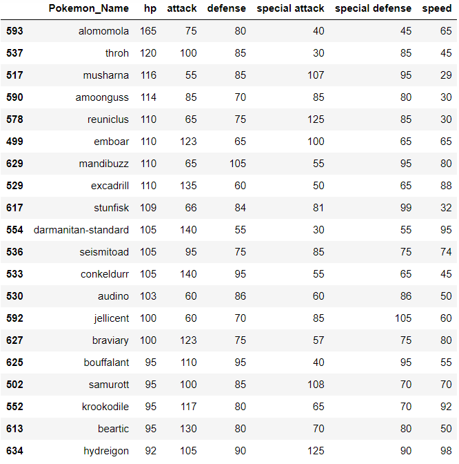
Observing the barplot and the data frame, the Pokémon alomomola has a much higher hp base stat compared to all other Pokémon.
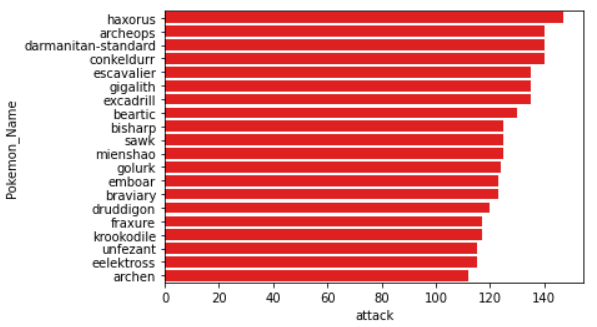
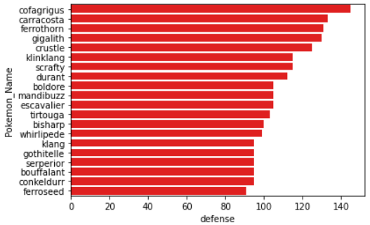
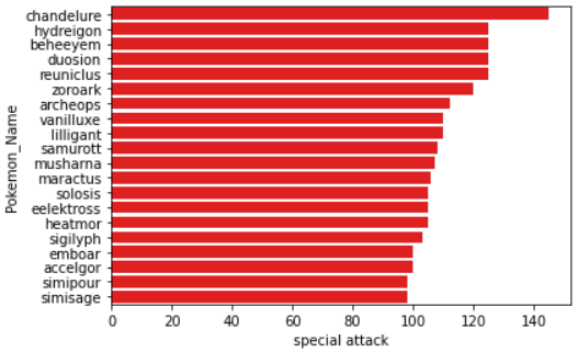
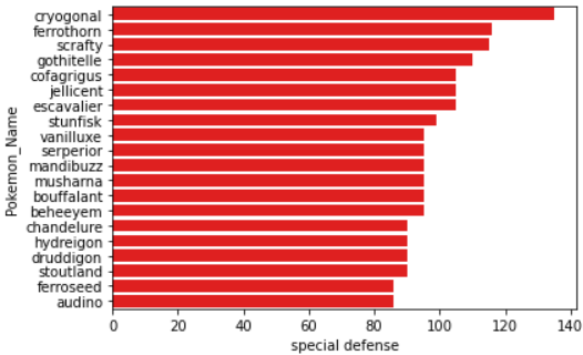
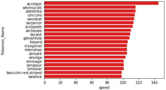
The above code can be used to find Pokémon with the top attack, defense, special attack, special defense, and speed base stats. The Seaborn horizontal bar plots should look like the ones below for each base stat:
Lastly, I created another column in the original data frame where each row was summed to get the total of the base stats for each Pokémon. The code was used below to create that column:
black_and_white_df['base_stats_total'] = black_and_white_df['hp'] + black_and_white_df['attack'] + black_and_white_df['defense'] + black_and_white_df['special attack'] + black_and_white_df['special defense'] + black_and_white_df['speed']
Likewise, the data frame and barplot can be created for the top 20 rows of the new column with the following code and output:
base_stats_total_df = black_and_white_df.sort_values(by='base_stats_total', ascending=False).head(20)
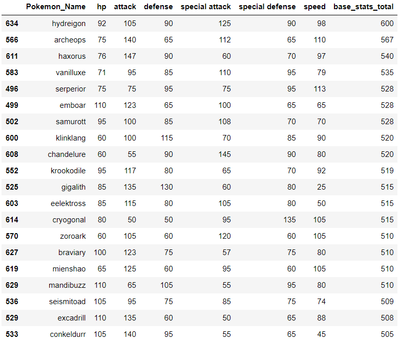
sns.barplot(y='Pokemon_Name', x='base_stats_total', data=base_stats_total_df, color='red')
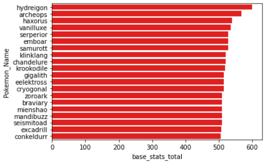
Based on the data frame and barplot, the Pokémon hydreigon has the highest base stats total, keeping in mind that the data frame excludes legendary Pokémon.
Conclusion
In summary, I was able to create tables and visualizations to analyze which Pokémon had the highest individual base stats and which Pokémon had the highest base stats total. I was able to gauge what base stat values would be considered “above average” by looking at the averages and the quantiles for each base stat. In my next blog post, I will share the story of the data and analyses I had made, including which Pokémon I would train and ways I could improve my analysis. Comment below other visualizations that would have been interesting with the data!